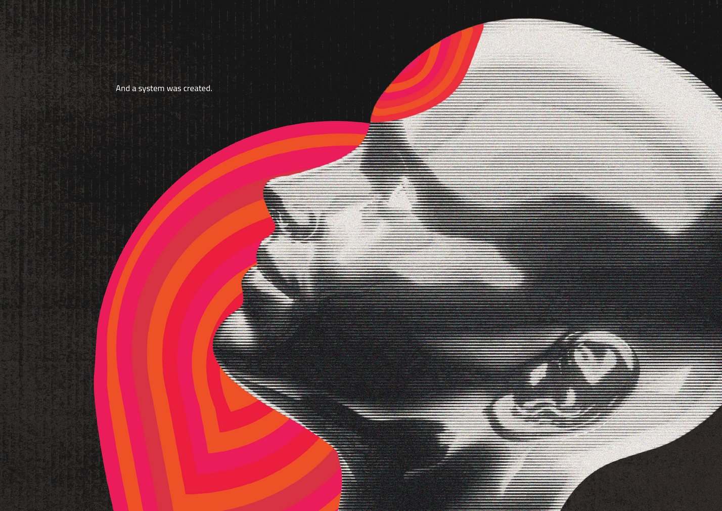
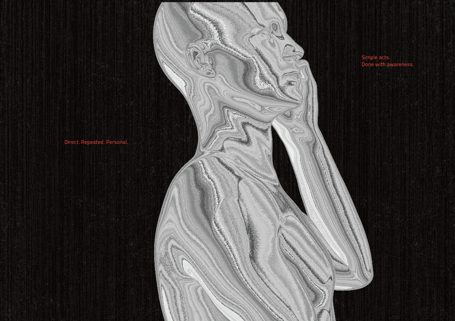
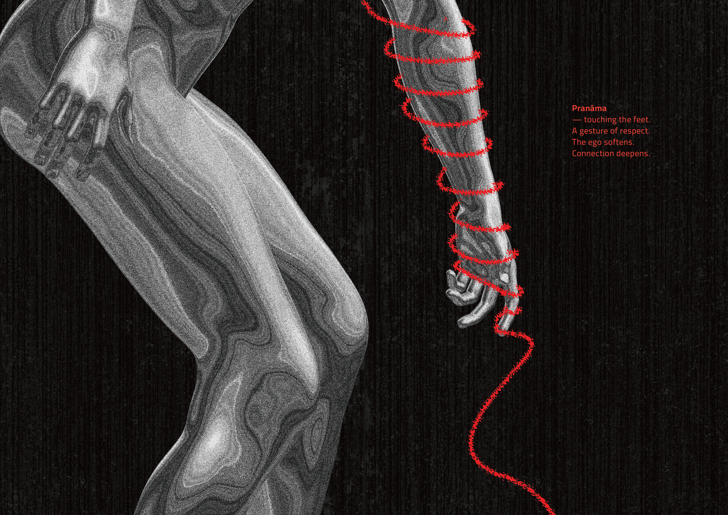
This project Hinduism came from my own search. I always felt Hinduism is more than just a religion — it is a way of seeing life, time and the mind. When I started my master’s, I wanted to take these ideas and translate them into design. The book became my canvas, where philosophy and visuals meet. I worked with black, white and red because they felt strong and timeless. For me, this work is not just about making a book, but about reimagining old knowledge in a language that today’s generation can look at, hold, and connect with.

Core Book – Hinduism
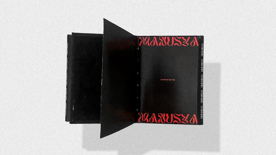
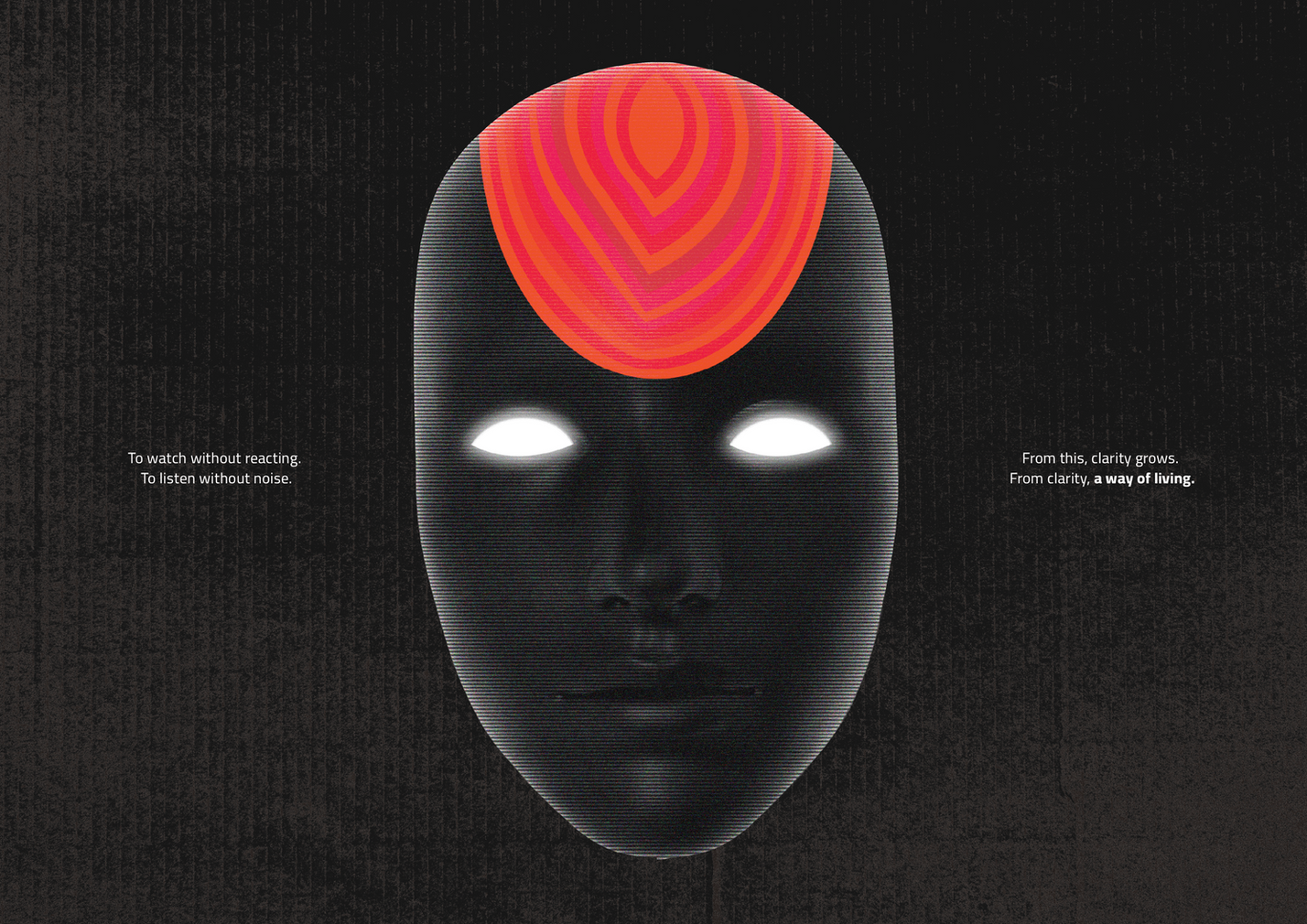
The central book, Hinduism, represents the inner eye — a way of seeing beyond the surface. It does not preach, but instead invites reflection. The book uses layered pages, cut-outs, and strong contrasts to create depth, silence, and space for thought. Each spread is designed like a poster, carrying singular meaning, yet together they form a non-linear narrative. This book is the heart of the project — showing Hinduism as knowledge, not as fixed belief, but as insight that keeps unfolding.
Book 1 – Brahmāṇḍa (The Universe)
The universe book explores Hindu cosmology, where creation and time move in cycles, not in straight lines. The design here is expansive — geometric grids, abstract compositions, and repeating patterns suggest infinity and rhythm. The spreads feel large and open, almost breathing like space itself. It visualises the idea that the cosmos is not far away, but deeply connected with human life.
Book 2 – Manushya (The Human)
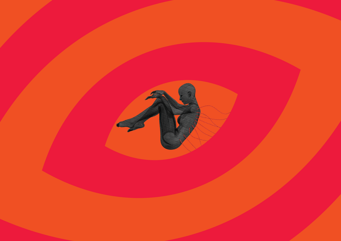
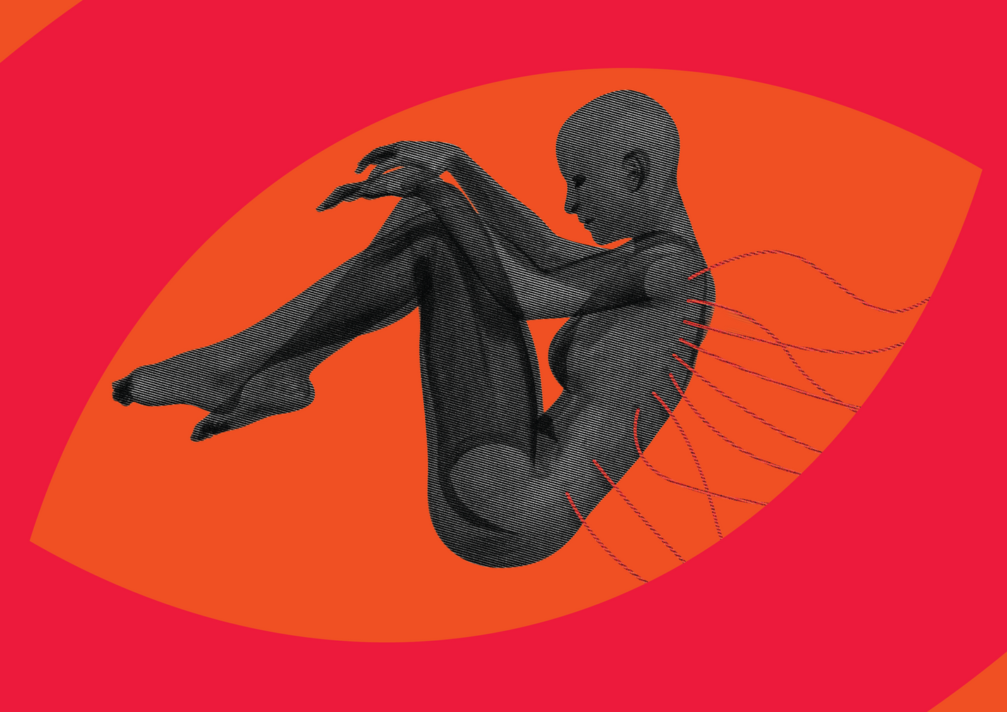
The human book turns the focus inward. In Hindu thought, the mind is both the root of struggle and the path to clarity. This book is designed in a more intimate way — using symbolic typography, human forms, and layered motifs. It connects the reader back to the larger system, showing that the universe and the inner eye are both mirrored in the human being. This sub-book grounds the project in lived experience.
Behind the Scene
The process was as important as the outcome. I spent time with scriptures, writings, and symbolic references, but I always approached them as a designer — asking how an idea could live visually. Sketching, typography experiments, and material trials shaped the form. I studied different bindings and chose Japanese stab binding because it reflects both strength and precision. The behind-the-scenes journey was about balancing respect for tradition with freedom to reinterpret through design.

Final Outcome
The final work is a system of three books — Hinduism at the centre, with Universe and Human as two reflections. They can be read in any order, looping back into each other. The outcome is both a publication and an artwork: bold typography, poster-like spreads, symbolic cut-outs, and a structure that opens from the middle. It reimagines Hinduism as design — not as an object of worship, but as a living knowledge system that can still shape how we think, see, and create today.

For me, this project is not about answers, but about creating space for reflection — where design and philosophy can meet. Thank you for viewing. I would love to hear your thoughts on this project.
Disclaimer
This project is a personal design exploration and not a religious text. It interprets ideas from Hinduism as concepts, symbols, and philosophies through the lens of art and visual communication. The intention is to explore knowledge, not to represent or replace traditional beliefs.


